
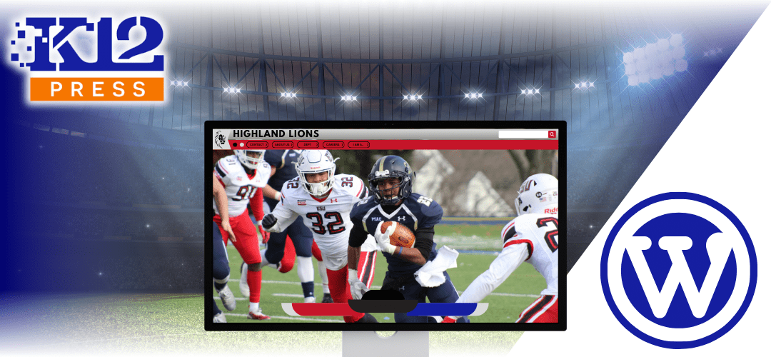
In our continuous effort to empower school districts with the best tools for building engaging and professional websites, K12Press WebmasterHUB presents our newest video tutorial: “K12Press Tutorial: Divi Padding & Margins.” This comprehensive guide is designed to unlock the full potential of the Divi Theme, focusing specifically on the nuanced art of adjusting padding and margins to create visually stunning websites that reflect the excellence of your educational institution.
Why Padding and Margins Matter
The layout of your website plays a crucial role in how content is perceived. Effective use of padding and margins can transform a cluttered page into an organized, accessible, and aesthetically pleasing experience. These elements are not just about space; they’re about breathing room for your content, emphasis on important sections, and creating a flow that guides visitors through your site with ease.
What You’ll Learn
Our latest tutorial goes beyond the basics, providing you with a deep dive into how padding and margins can be adjusted within the Divi Theme to enhance your school’s website. Key takeaways include:
- Understanding Padding and Margins: Learn the difference between padding (space inside an element) and margins (space outside an element) and why each is important.
- Visual Builder Techniques: Discover how to use Divi’s visual builder to adjust padding and margins, offering you real-time previews of your adjustments.
- Responsive Design Tips: Gain insights into making your website look great on any device with tips for responsive design adjustments.
- Advanced Layout Strategies: Explore advanced strategies to achieve more complex layouts and visually appealing designs that engage your visitors.
Design Your School’s Website with K12Press
This tutorial is part of our commitment at K12Press to provide educators, administrators, and IT professionals with the resources they need to create top-notch digital environments for their communities. By mastering these design principles, you can significantly improve the usability and appearance of your school’s website, making it a more effective tool for communication and engagement.
Whether you’re updating existing content or building a new site from scratch, the skills covered in “K12Press Tutorial: Divi Padding & Margins” are invaluable. We encourage you to watch the tutorial, apply what you’ve learned, and see the difference it makes in your school’s online presence.
At K12Press, we’re dedicated to supporting the educational community with high-quality resources and tutorials like this one. Stay tuned for more helpful guides and updates that will help you leverage the power of digital media to enhance your school’s educational mission.
Watch the tutorial now: K12Press Tutorial: Divi Padding & Margins and take the first step towards a more engaging and professionally designed website.
Step by Step | Use Divi Visual Builder to Adjust Padding & Margins for an Optimal Layout
Step 1: Understanding Padding and Margins
- Padding is the space inside the container, providing spacing between the content (like text or images) inside that container and its edges.
- Margins are the space outside the container, creating distance between the container and other elements on the webpage.
Step 2: Accessing Divi’s Visual Builder
- Navigate to your website’s dashboard.
- Open the page you wish to edit in Divi’s Visual Builder.
Step 3: Adjusting Padding
- Hover over a section/module to reveal its settings, then click the gear icon to access settings.
- Go to the Design tab, then find the Spacing option.
- Here, you can adjust the padding values for the top, bottom, left, and right. For example, setting top padding to 127 pixels creates space within the section at the top.
- Use the link icon between fields to ensure symmetrical padding on opposite sides.
Step 4: Adjusting Margins
- In the same Spacing area, adjust the margins to create space outside the container. This is useful for separating sections visually without affecting the internal layout.
- Negative margins can be applied for creative design effects, such as overlapping elements.
Step 5: Responsive Design Adjustments
- To ensure your website looks good across all devices, consider using percentages instead of pixels for a more responsive design.
- Divi allows you to set different padding and margin values for desktop, tablet, and mobile views. Use the mobile icon in the spacing settings to adjust for each device type.
Step 6: Practical Examples
- Example 1: To make a logo pop between two sections, adjust the top margin to create the desired overlap effect.
- Example 2: For buttons, adding padding around the text enhances readability and aesthetic appeal. Adjust margins to position the button perfectly within its section.
Step 7: Testing and Tweaking
- Always preview changes on different devices. Adjust padding and margins in tablet and mobile views as necessary to maintain a cohesive and user-friendly design.